Doc's Soda is a current client branding project by my freelance team, Klei design. The work below is a collaboration between two other team members and I. When the client for Doc's originally reached out to us we were so thrilled to have such an exciting project! Dr. Barlow is an ER physician who has been dreaming of opening a soda shop for years. The Barlows provided us clear and extensive direction and inspiration for their brand. The doctor's office has inspired many of the brand attributes.
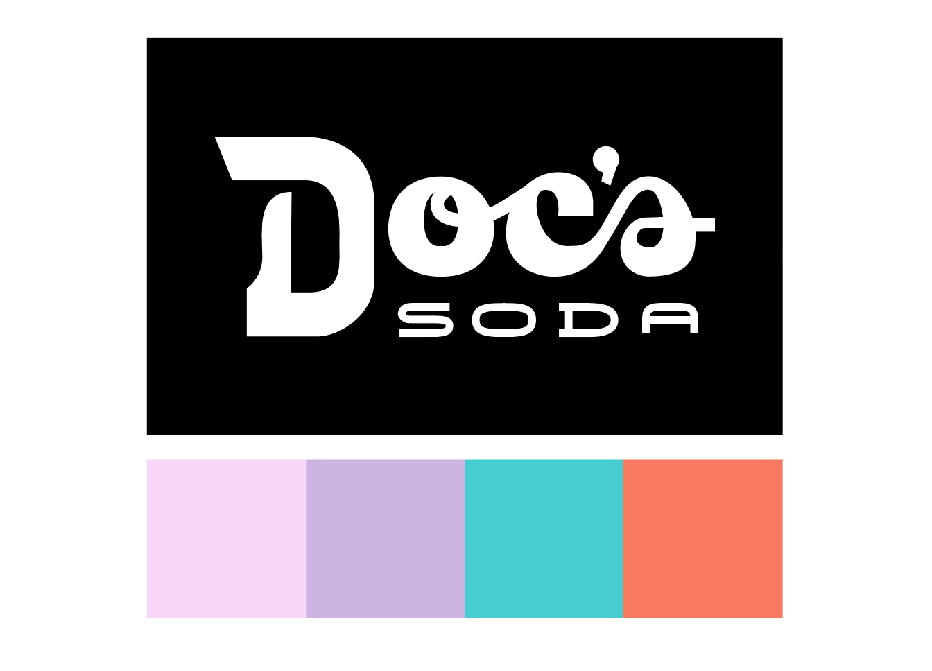
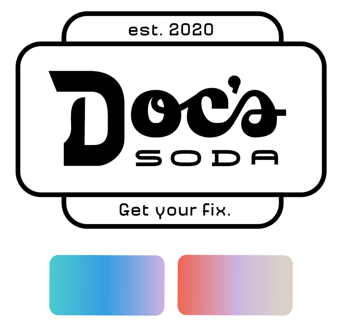
The Doc's logo was designed by me, with collaboration from team members. The type is all custom. "Doc's" is based of of the vintage Rexall medicine bottles that the Barlows provided for us as inspiration. The Barlows also wanted to incorporate an art deco feel, so the "Soda" type has an art deco base.
Black and white are the primary brand colors, inspired by "depression era doctor's office" from the client's initial brief. We added in the invigorating blue, orange and purples as accent colors to make the brand feel lively and relevant. The main customer base for the soda shop will be high schoolers and middle-aged cool moms, so we wanted to overall brand to draw in those customer groupings.
We analyzed the many drink competitors and noticed that many of them use red as their primary brand color. In order to differentiate from those companies, we avoided red and instead found colors inspired from the Rexall bottles and art deco era.
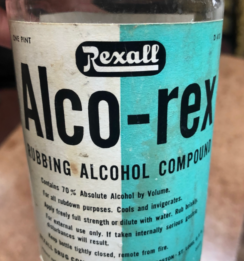
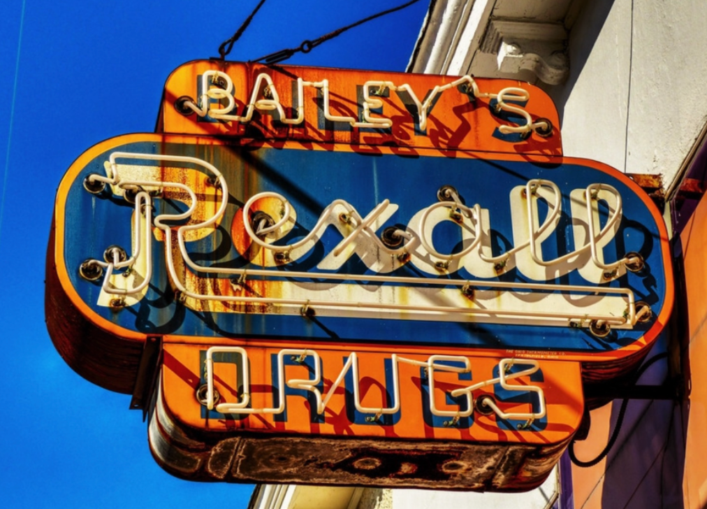
Above: Color and type inspiration provided by the client.
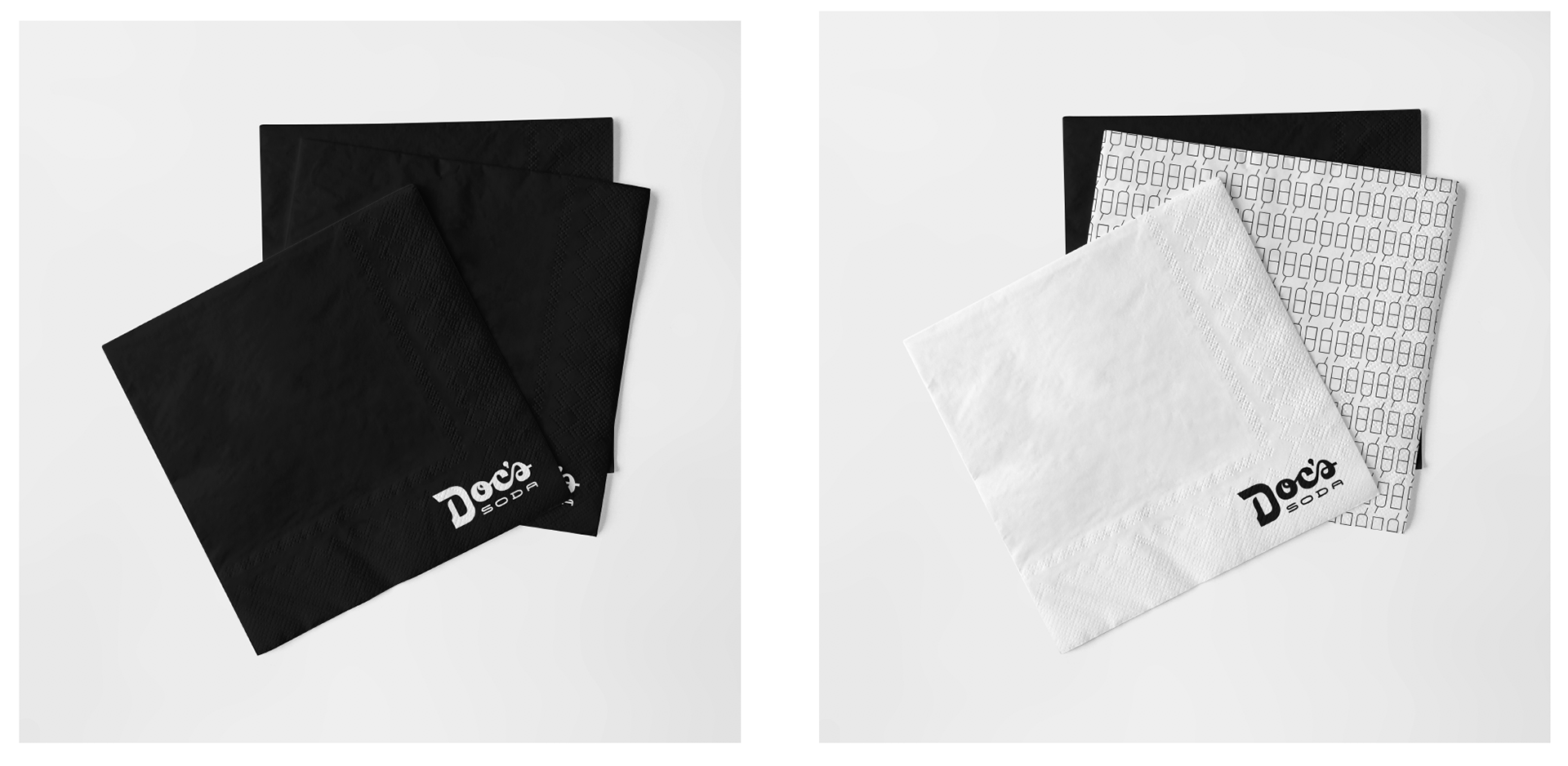
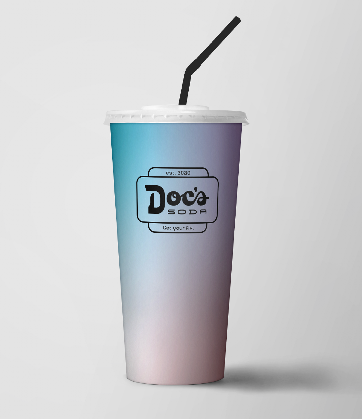
Above: In-store packaging designed by Valerie. Napkins with the soda/pill bottle pattern and cup with brand gradient and logo lockup. The client favored a primarily black and white color scheme with the other colors as accents.
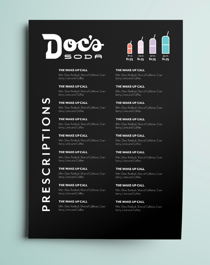
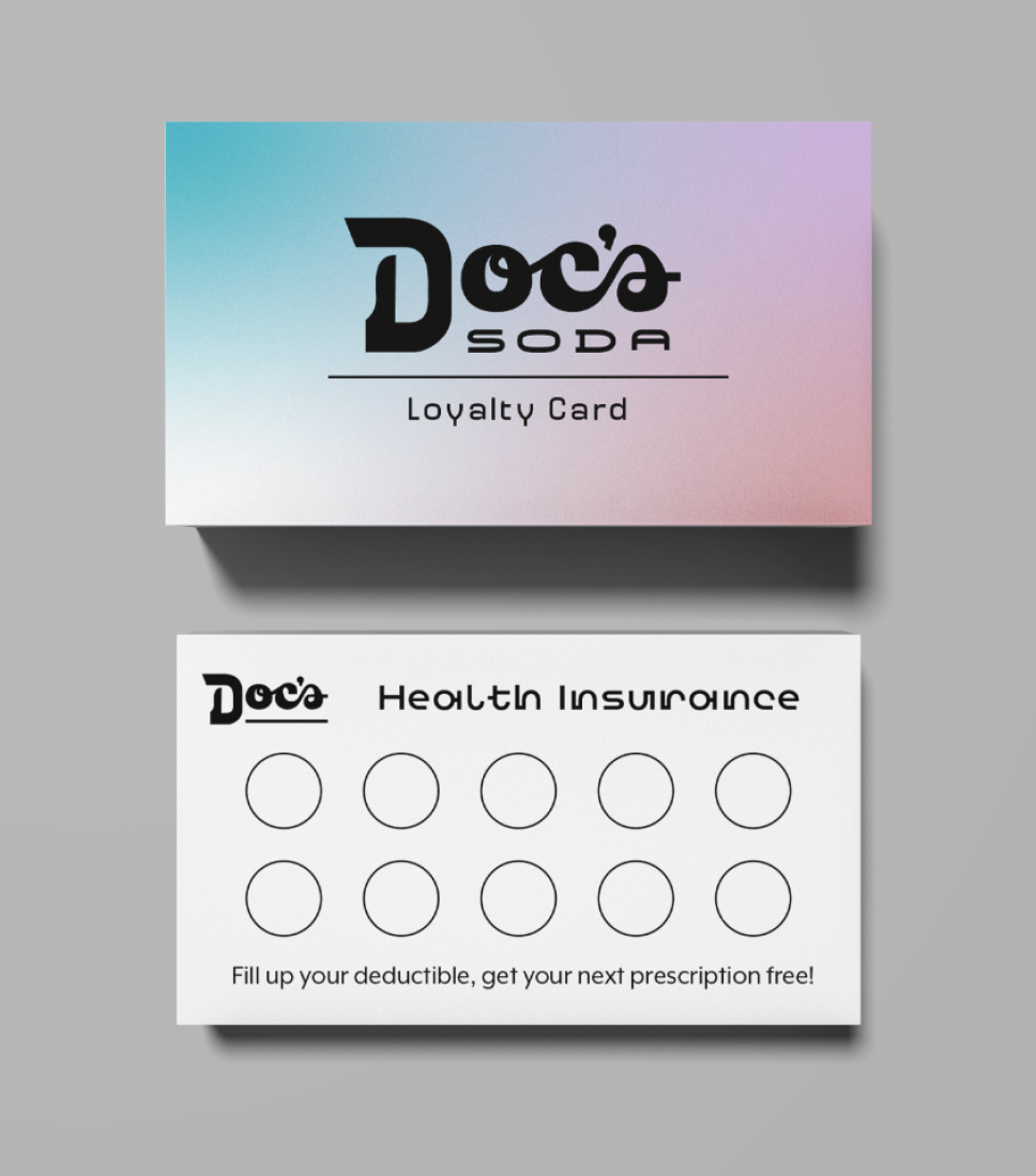
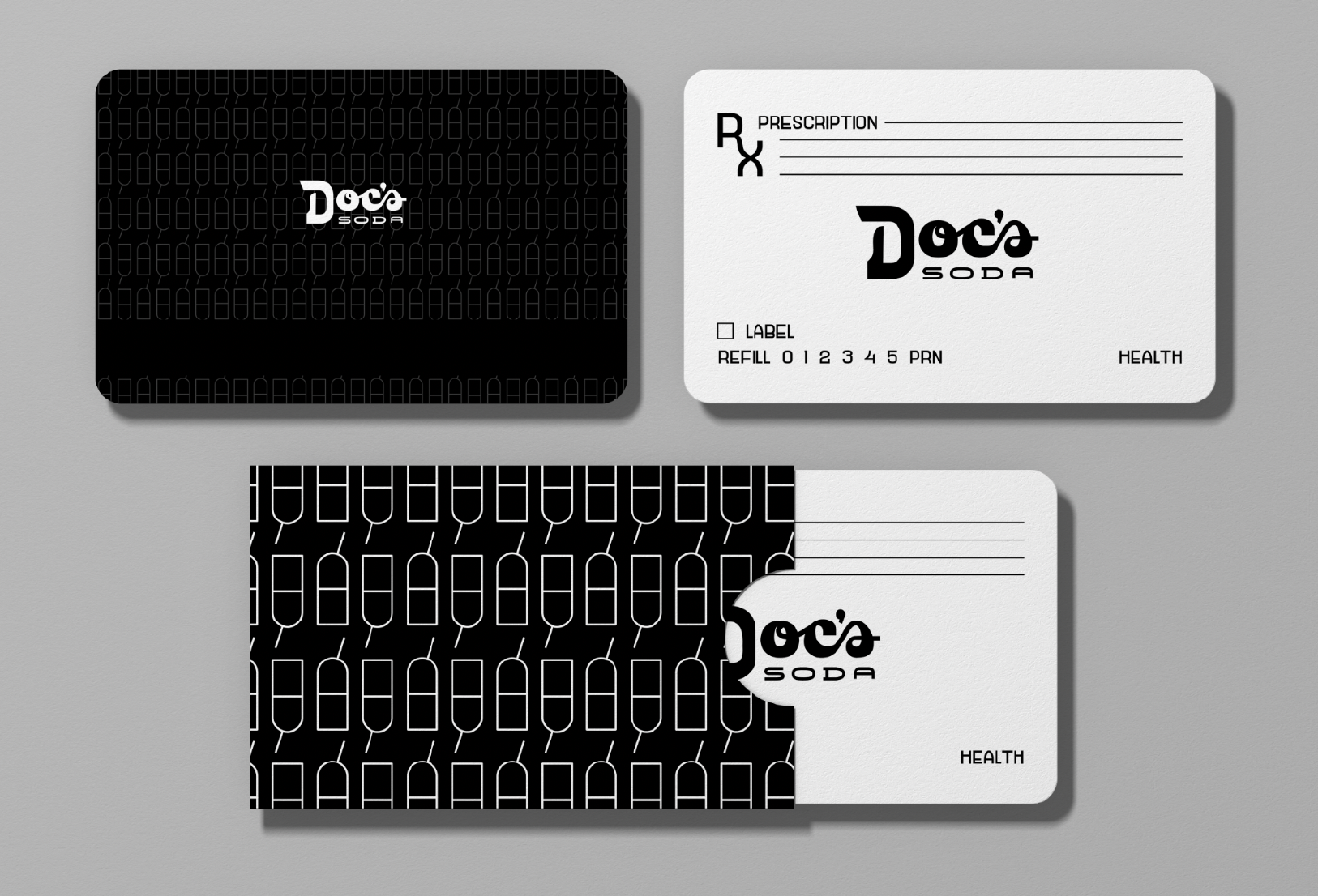
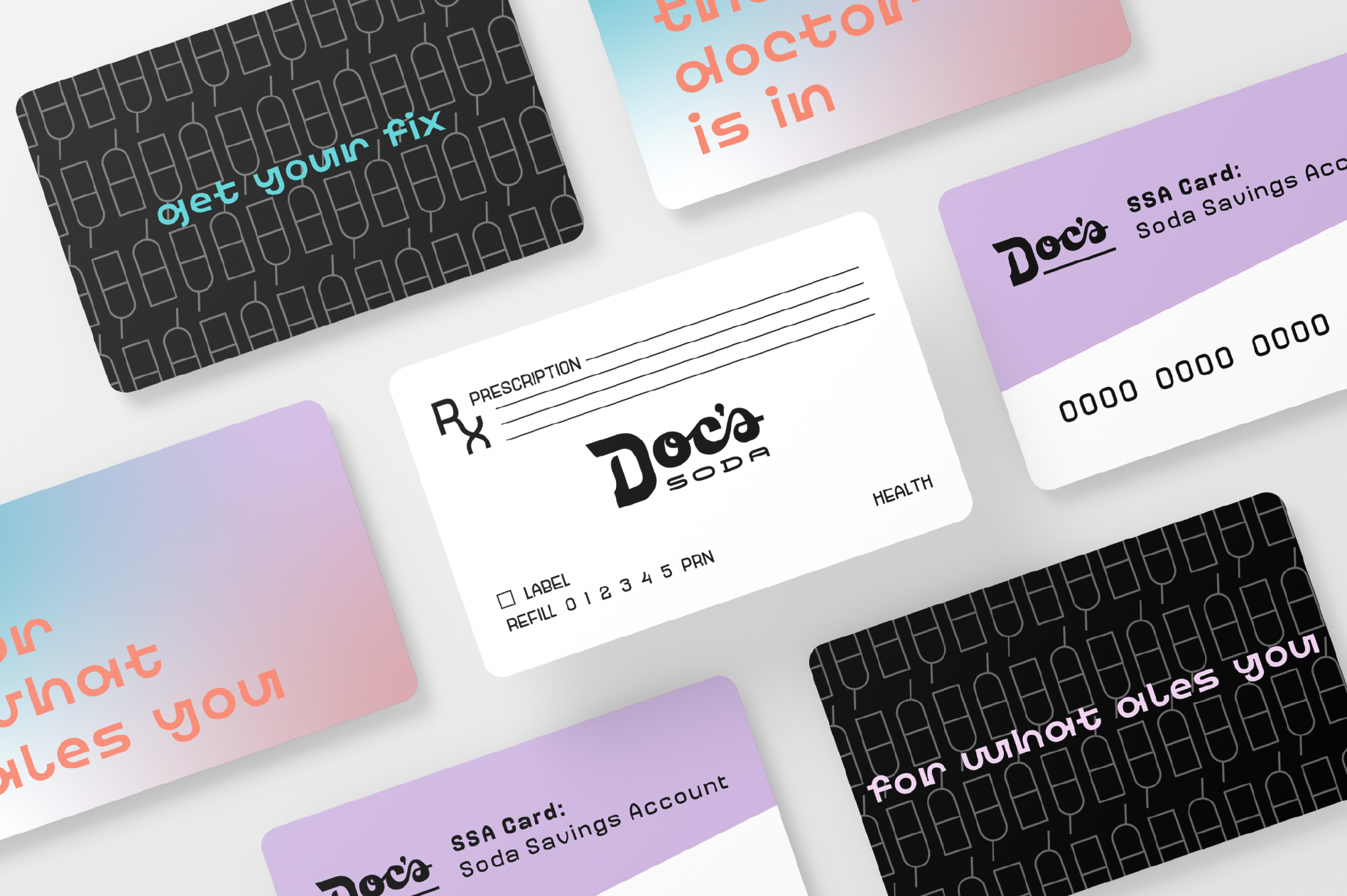
Above: In-store printed assets. In progress menu with sizing indicated by colors. Menu designed by Anna. The loyalty card and many of the gift card concepts were based off health insurance documents, such as meeting your deductible for the loyalty card, a prescription gift card and a "soda savings card" inspired by a health saving account. Cards designed by me.
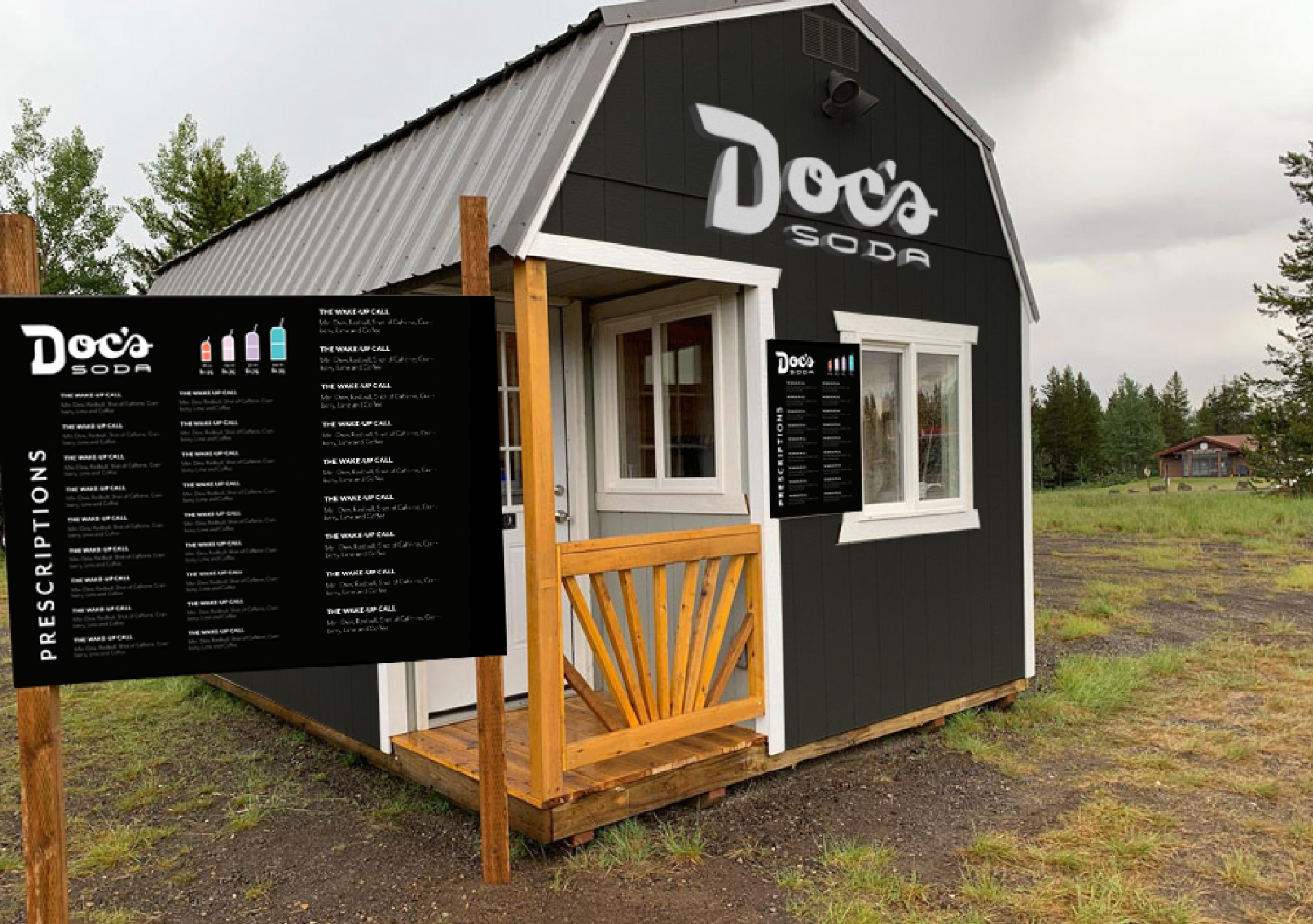
Above: Soda shop mockup designed by me, menu designed by Anna. This is not how the actual building will look, but the mockup helped give the client an idea of how the whole brand can come together and how to apply the logo to the building.
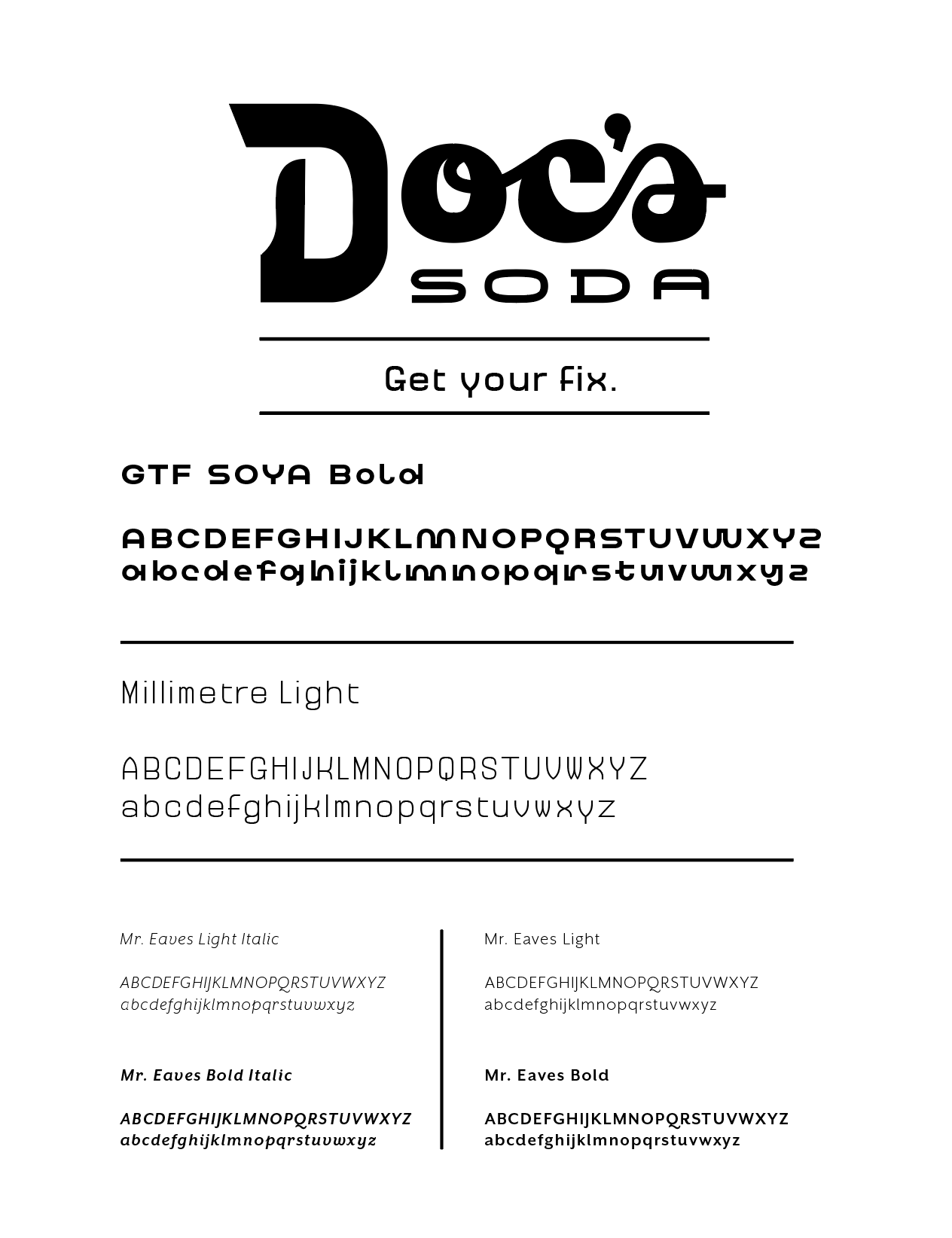
Above: Brand typography by me. Art deco inspired type.